Welcome to the Qstream brand design hub, where creativity meets consistency
Our logo was designed to be a symbol of our company. As such, we have rules around how it should be displayed in various situations.
Full Colored Logo
Black & White Logo
Light Logo
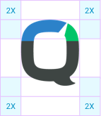
We always give our logo enough room to breathe. By putting rules in place for minimum padding, it allows the logo space to be recognized.
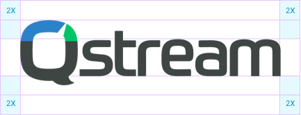 2x means double the spacing from the tip of the lower casing letters to the top of the Q.
We have introduced constraints around the usage of our logo to ensure that there is consistency when the branding is being used. It is very important that we use the logo and symbol as designed.
Do Use Downloadable Assets
Always use the recommended downloadable assets that are available here.
Do Use Correct Spacing
Please adhere to the padding rules to give our branding enough space to be exposed correctly.
Don’t Change the Color
We use certain color palettes for our logo. Please do not tamper with them.

Don’t Change the Structure
Never change the structure of the logo. A consistent structure ensures it is recognizable.

Don’t Abbreviate
We have a logo and a symbol. Please don't refactor the logo to suit your needs.
Don’t Distort
Please refrain from distorting the logo or symbol. If you're having issues regarding distortion, please speak to a colleague from the design team.
Qstream Blue
Hex: #2C82C9
RGB: 44 130 201
CMYK: 78 41 0 0
Qstream Green
Hex: #00c468
RGB: 0 196 104
CMYK: 73 0 81 0
Aqua
Hex: #26CAD3
RGB: 38 202 211
CMYK: 65 0 22 0
Qstream Orange
Hex: #f9B835
CMYK: #
Primary Text
Hex: #2e3d49
RGB: 46 64 73
CMYK: 81 65 51 43
Secondary Text
Hex: #6E7881
RGB: 110 120 129
CMYK: 60 46 40 9
Background Grey
Hex: #F4F5F6
RGB: 244 245 246
CMYK: 3 2 2 0

Background Grey
Hex: #F4F5F6
RGB: 244 245 246
CMYK: 3 2 2 0
- Use the colors as per their correct use cases.
- Use the full set of colors to enhance the platform
- Try not to use tints or opacities of the chosen colors.
- Never mix the use cases of the colors.
There may come a time that you need to bend the rules slightly to make the color palette work. This does not mean use colors outside the color palette.
It means that you can change the usage of the colors depending on issues arising. Try not to deviate from the rules.
If you find any colors being used outside of the palette within any aspects of the business, please ensure that you call it out to fix it.
The color palette should be the only colors ever in the platform (except for special occurances that need to be discussed).
We have chosen a font that works for our company's brand. Roboto is our primary font. It is an open source font so is widely available. To download the Roboto font, go to https://fonts.google.com/specimen/Roboto
Roboto is an extremely versatile font with a wide array of weights available. We use the same font across all aspects of our content, for both headers and paragraph text. We constrain our font weights in our product to create simplicity, only allowing Bold and Regular as options. On our marketing site, we open up the weight classes and allow a choice of 4 weights.
When our primary font is not available, we fall back to a secondary font that is available on both Windows and Mac operating systems. For this instance, we use Tahoma as our fallback. The rationale for this choice is due to the font's similar structure to Roboto. Tahoma is an extremely well-crafted font which works across all operating systems.
© Qstream, Inc. 2018. All rights reserved.


