
We use a selection of illustration and icon styles across our brand and product. Here we outline how to use the styles correctly and effectively...
We have a simple color palette. We use our core color palette to push our brand identity as much as possible.

Spot illustrations are used to showcase specific features, to help educate the user in times of confusion, or to add life to a page. They should only be used in larger instances, where the detail can be seen clearly.

Medium icons are used to draw the eye to specific areas of interest on the feature. They are not used to explain or to communicate too much information, but more to highlight a certain component.

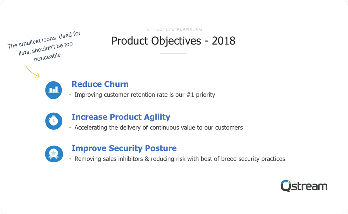
Small icons are nothing more than glorified glyph icons. They are used for lists, or for highlighting areas, but are not to be of a considerable size that they would be too noticeable.

We have different ways we use our icons and illustrations. Please consider these rules when choosing your elements. Never use the small icon in place of a large illustration or vice versa. It's important that we keep consistency when using our icon sets.


© Qstream, Inc. 2018. All rights reserved.